The stock of Oracle (ORCL), the database software and cloud computing service giant, popped up after the latest earnings report. In fact, ORCL is up over +50% in just the last 2 months! Headlines focus on investments into AI data centers under the “Stargate” project and strong demand for cloud services.
Does that mean ORCL has long-term momentum to keep compounding? Or will growth slow compared to other investing opportunities out there? Rather than prognosticate on short-term headlines 🔮📰 let’s do a quick analysis of long-term quality, growth, and value trends.
🏰 Quality
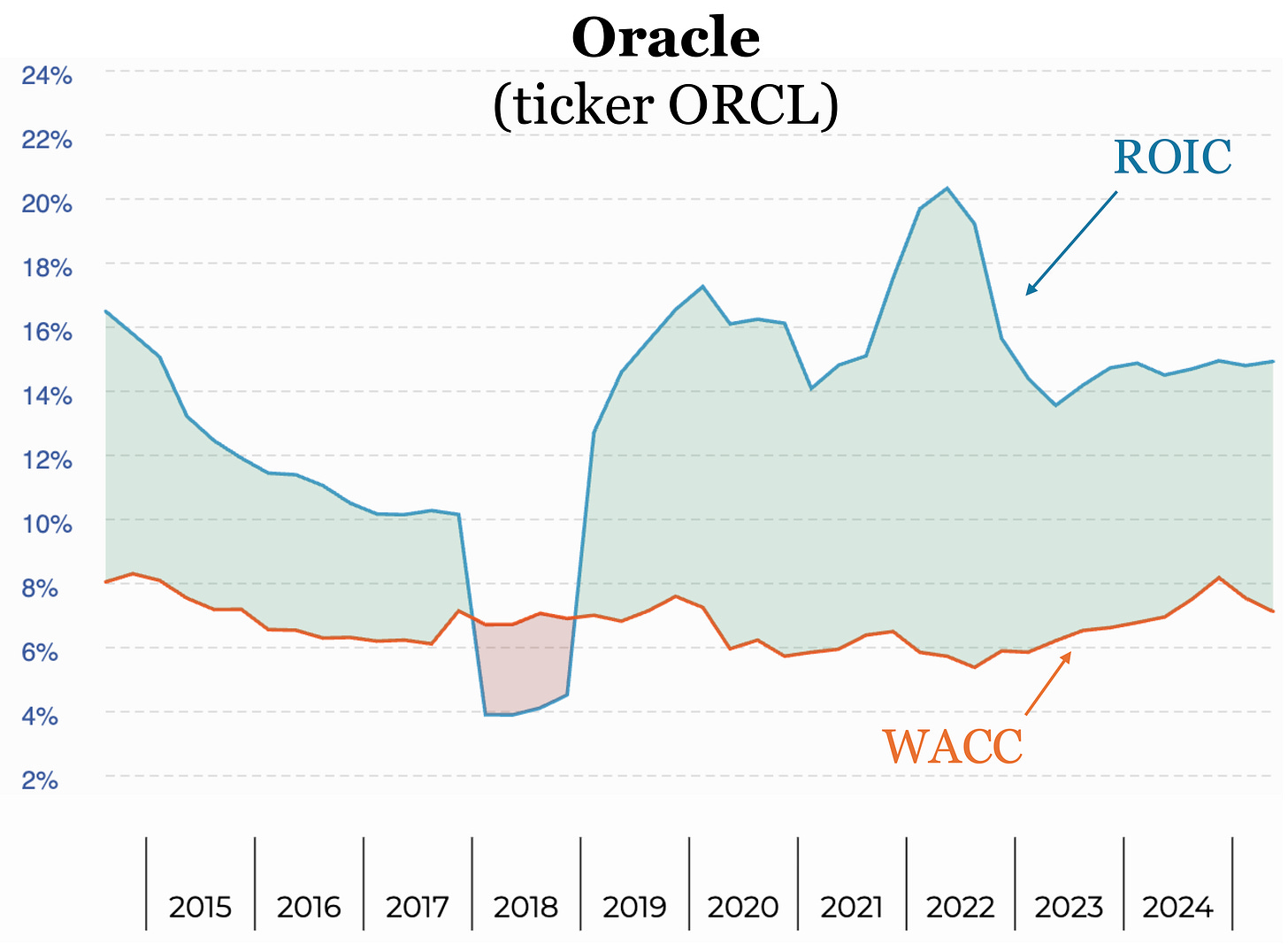
Here’s a plot of Return On Invested Capital (ROIC, blue) and Weighted Average Cost of Capital (WACC, orange) going back 10 years. As we learned in 📖 “Stop Checking The Price!” a high, steady, and (ideally) increasing ROIC that is well above WACC shows the company is creating long-term value.
We see ORCL maintained a steady ROIC over the last 5+ years, though only around 15% compared to a 7% WACC — not the largest ROIC-WACC spread we have encountered. Nonetheless, ROIC > WACC is a simple signal for long-term value creation.

📈 Growth
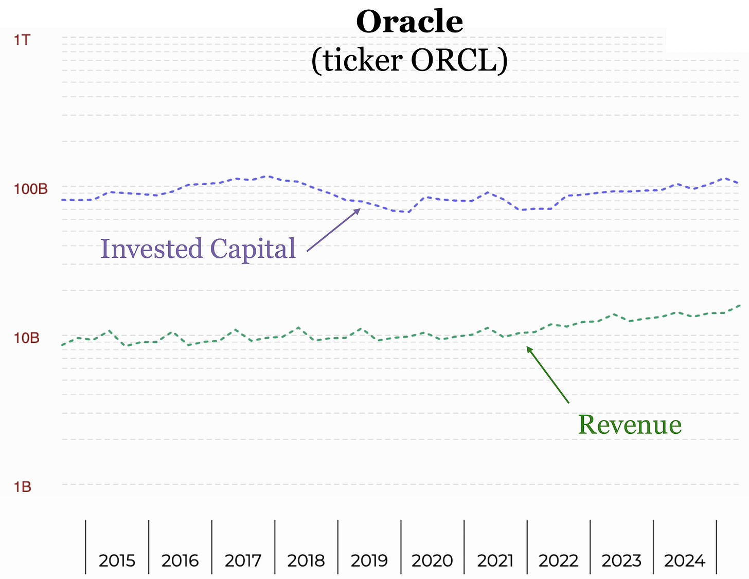
Next let’s take a look at the growth of Invested Capital (purple) and top-line Revenue (green). These are plotted on a vertical log scale, so a straight line would correspond to exponential growth. A higher slope line then has a faster rate of exponential growth.
⚠️ What To Watch: From the long-term trends, we see both IC and Revenue are not exactly running away. Indeed, revenue only grew around 4% CAGR over the last 10 years. Even with ROIC > WACC, a flat IC means ORCL is not a “Compounder” by our definition: reinvesting earnings to grow & compound IC while maintaining high ROIC.

💰 Value
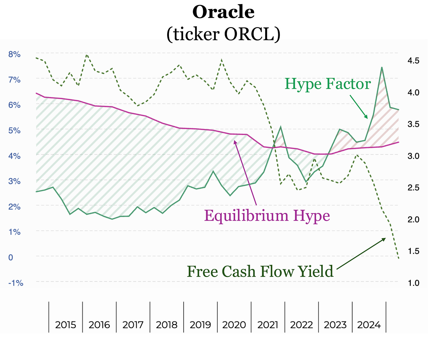
Lastly, let’s see how the market values ORCL. Here’s a plot of the Hype Factor (green), which is a ratio for the Invested Capital (IC) “acquiring cost” — it’s the market price we pay to acquire the IC divided by the book value of the IC.
The Equilibrium Hype (purple) is the long-term median value. By comparing the Hype Factor with Equilibrium Hype, we get a sense of how IC is valued now compared to how the market valued IC historically.
The Hype Factor has remained above the Equilibrium Hype since 2023, so that puts hype on the more expensive side compared to the market’s historical valuation.

⚠️ What To Watch: Also plotted is the Free Cash Flow Yield (FCFY, dark green) which measures the free cash flow we get out compared to the share price we put in to own a share. FCFY has been dropping since 2021, which means less cash out compared to what we put in.
Low free cash flow yield isn’t necessarily a bad thing if the company is plowing cash into great investment opportunities (meaning less “free” cash left over after capital expenses). However, that hasn’t yet been reflected in the long-term IC-ROIC trends.
Remember that no one can 🔮 predict the future — especially in the near term — but by studying the long-term trends of key metrics we can avoid getting caught up in the latest nonsense news headlines.
Invest for the long-term and keep compounding knowledge! 📈🧠
📺 Want to follow along on Youtube?
Please check out & subscribe to our 📺 Youtube channel where we will go into detail on these investing topics and more!
🔍 Want to analyze your favorite stock?
Want the tool that makes it easier than ever to find high-quality stocks in deep value territory? Check out 🔍 ValueGlance.com to visualize long-term trends rather than short-term hype!
📖 Want to learn the high-quality stock strategy?
Want to learn the simple strategy to find high-quality, value-creating, money-printing stocks? Get a copy of 📖 “Stop Checking The Price!” on Amazon!


