

Seeing The Exponential
How To View Amazon's Growth & Walmart's Rollover

Read time: 5 minutes

🥜 In A Nutshell:
To really visualize data, use the Log scale to plot long-term compounding quantities
Plotting revenue correctly can easily demonstrate the type of growth scaling of any stock
Amazon & Walmart show exponential growth & rollover on their journey to $100 billion quarterly revenue
Data Visualization: If It Compounds, Then Log It!
Thomas Malthus predicted that population growth would outpace agriculture and the consumption of resources. While innovation continues to challenge that story and unlock additional growth, the reality is that we live in finite world with finite resources… until we start mining other planets of course.
Naturally, the companies that operate in this finite world are also limited as they expand and dominate their market. While businesses are complex entities, we can look at simple metrics to track growth and, in particular, how growth scales.
By studying Warren Buffett’s wealth growth, we saw how proper plotting easily reveals the exponential behavior of a compounding quantity. The main advantage to quickly interpret visual data is that a straight line on a log scale corresponds to exponential growth. This separates any fast growth — sometimes described simply as “going parabolic” — from real compounding: growth generating more growth. While Buffett’s billions are a neat example, let’s see what proper plotting tells us about the growth of the largest companies.
Revenue is the “top line” of the income statement — the money a company brings in from selling goods & services before subtracting out expenses. While most of the largest revenue-generating businesses are in the oil & gas industry, the two largest retailers are ranked at the top: Amazon (AMZN) and Walmart (WMT). Together they tell an interesting story about growth — and the inevitable limitations — when plotted properly.
Amazon’s Exponential Growth & Walmart’s Exponential Rollover
Here is a plot of the quarterly revenue for AMZN going back to IPO. The vertical axis is on a LOG scale which compresses numbers across a wide range. Notice we can plot data from $10 million up to $1 trillion easily on this scale.
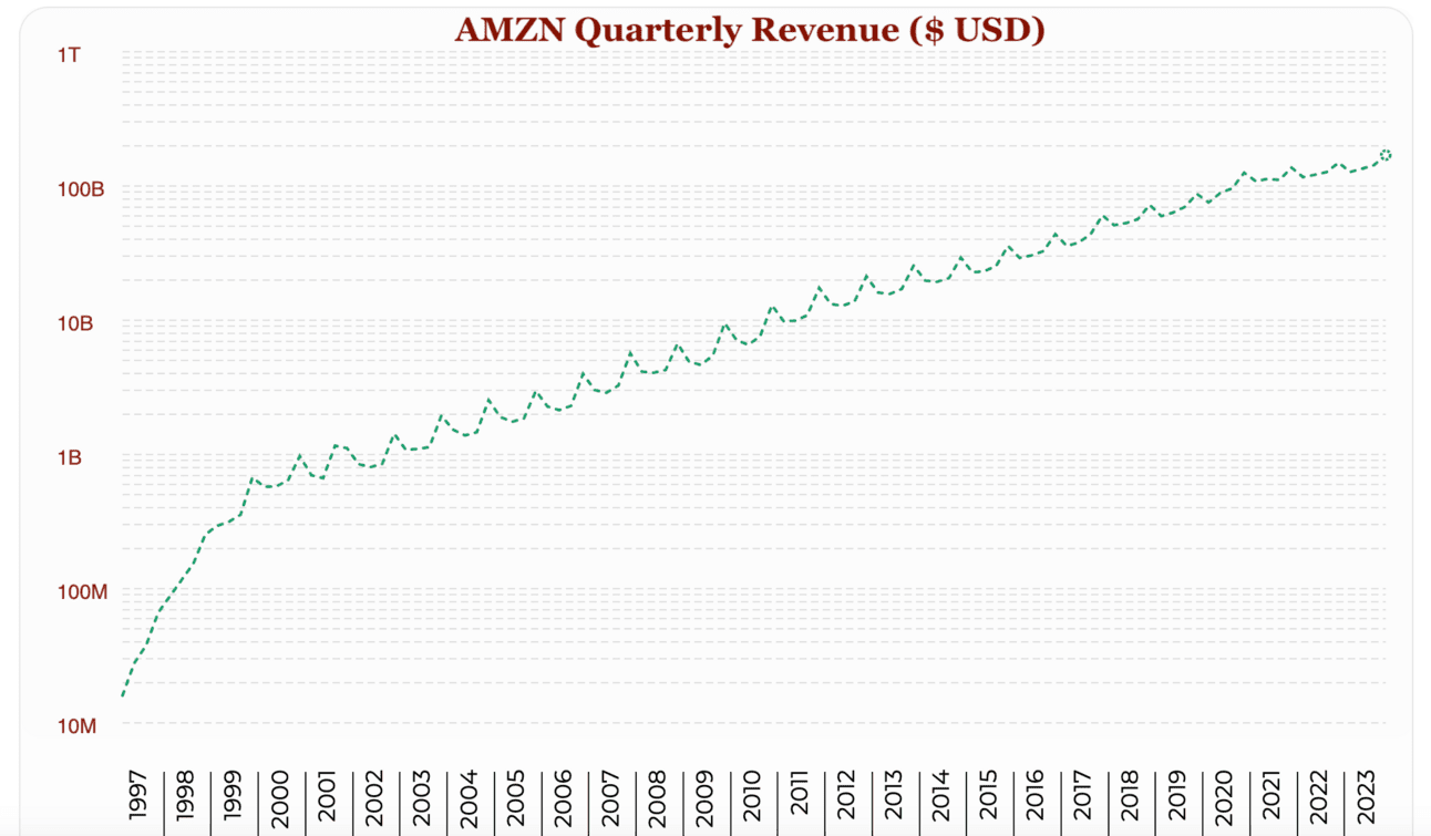
When plotted the right way, we see that AMZN maintained fantastic exponential growth of revenue for decades! The rate slowed out after crossing a couple hundred million dollars, but the exponential was sustained. This is demonstrated by a nearly-straight line (ignoring the annual fluctuations) that can be drawn from 2000 almost to present day. Quarterly revenue just continued to cross multiple milestones: $1 billion, $10 billion, $100 billion…
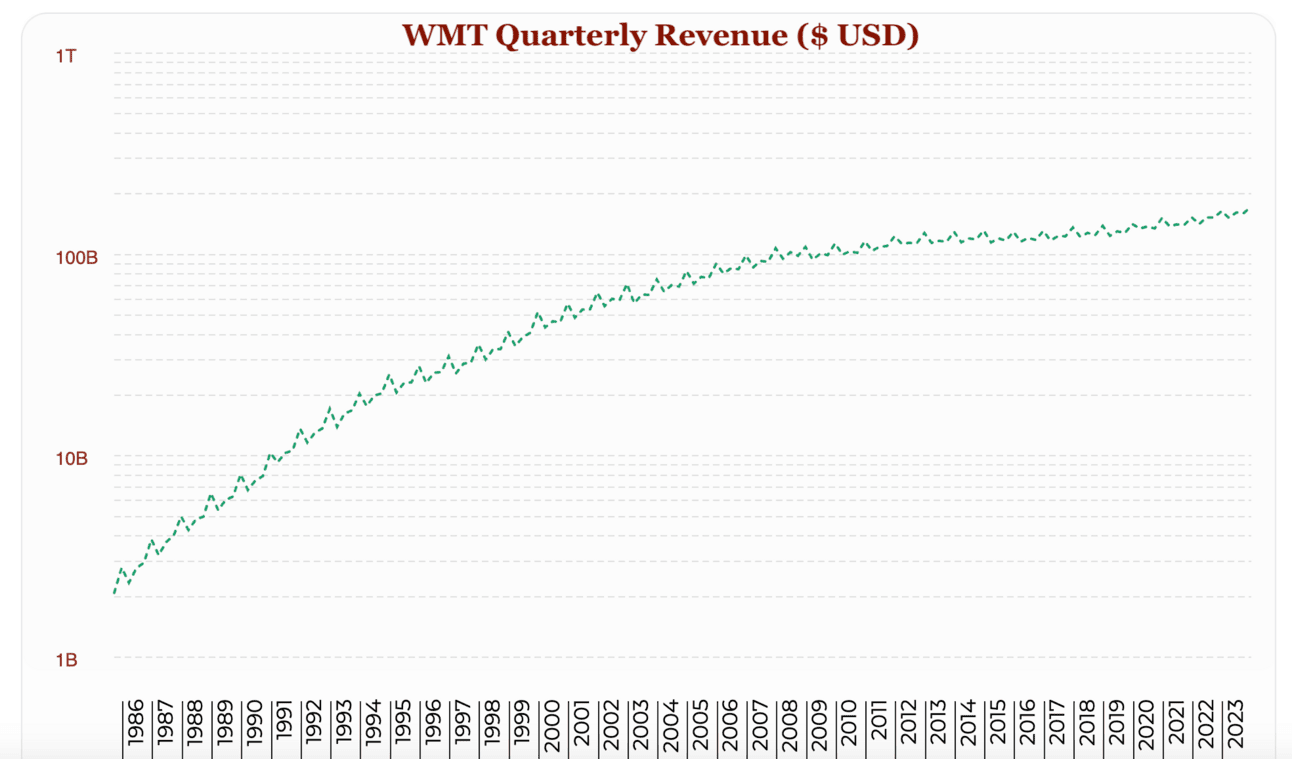
Now let’s take a look at AMZN competitor, Walmart (WMT), which went public in 1970. The plot below shows quarterly revenue going back to 1986, again plotted on a Log scale. We may be able to fit a straight line through the early 90’s, but it becomes clear that there is an exponential rollover. The revenue growth doesn’t sustain the rate of compounding — and things really flatten out past $100 billion.
There are many ways to interpret this, for example in terms of Malthusian competition for finite resources when companies get this large. And while we can’t predict the future, proper plotting allows us to easily identify the scaling of past growth over many years — whether it is truly exponential or not, and when that exponential starts to get saturated. Companies can pivot, find new profit pools, and kick their growth back into high gear — certainly not unheard of. But when you are pulling in $100 billion revenue each quarter, it becomes increasingly difficult to move that needle.
In a previous post we explored how smaller companies generates outsized returns, and in 📖 “Stop Checking The Price!” we even saw the benefits of filtering for high-quality small cap companies. Small companies simply have much more room to run. The point here is that when we want to quickly visualize that growth, we need to view the data the right way. Using the Log scale paints a clearer picture for how the biggest companies scale — and how they compounded their way there. By properly plotting data, it becomes a simple visual task to pick out long-term exponential growth between here and the Malthusian limit.
Bottom Line: Proper plotting easily identifies stocks with exponential growth!
📈🔍 Want the shortcut to find winning stocks?
Want the tool that makes it easier than ever to find high-quality stocks at non-bubble prices? Check out 🔍 ValueGlance to visualize long-term trends rather than short-term hype!
📖 Want to learn the Less Is More strategy?
Want to learn a super simple strategy to find high-quality, value-creating, money-printing stocks? Get a copy of 📖 “Stop Checking The Price!” on Amazon!